

Category Archives for Invest & Retire
How To Begin Saving For Retirement At An Older Age
————————————————————————————————————————
Welcome to My Personal Finance Journey! If you are new here, please read the “About” or “First-Time Visitor” pages to find out more about us. If you would like to receive free updates on articles like this by email, then sign up here or you can subscribe to the RSS feed. Also, check us out on Twitter or Facebook. Thanks for visiting! Keep on learning!
————————————————————————————————————————
Even though the stock market is near record highs and the economy is showing signs of improvement, many workers in the
Reduce Your Expenses
Examine your monthly expenses carefully to see if there are items that you can eliminate easily. Some people choose to cancel rarely used gym memberships, while some others choose to downgrade their cable package or take their lunches to work instead of eating out. Whatever money is saved should be deposited into your retirement savings account.
Try To Increase Your Income
When you receive a raise or a bonus at work, consider increasing your contribution to your retirement fund before you begin spending the money on other things. Your future self will thank you for your frugality.
Eliminate Your Debts
Increase Your Contributions To Your Retirement Accounts
Choose Additional “Safe” Investments
Do you feel pretty comfortable that you will have saved enough by the time your retirement rolls around?
Share your experiences by commenting below!
***Photo courtesy of http://www.flickr.com/photos/68751915@N05/6869770873/
Spring Cleaning Your Personal Finances

1.) Go through your paperwork
2.) Automate regular banking tasks with online banking
3.) Download helpful apps to streamline your banking
4.) Check your credit report
5.) Update your budget and long-term financial plans
How about you all? Do you have any regular monthly, quarterly, or yearly steps that you take to ensure your finances are on track?
If so, what do you do and how do you keep from forgetting to keep up with it?
Share your experiences by commenting below!
Jacob’s Thoughts – Listed below are my random thoughts as I was reading this article.
- Lots of good tips in this article, and a fair few that I do myself!
- As far as going through my paperwork, in general, I tend to keep up with sorting and organizing that pretty well. About once a month, I sort through the papers that have accumulated in my “inbox” and file them accordingly in my personalized financial filing system.
- Online banking also really helps me to de-clutter my life of paper files and to ensure that all of my bills get paid on time. In fact, I now have things set up so that I don’t actually manually pay any of my monthly bills by paper check. They are all handled online now. The only bill that I pay “manually” is my real estate tax bill that I pay twice a year! Nice!
***Photo courtesy of http://s0.geograph.org.uk/geophotos/02/31/43/2314318_0228a033.jpg
When Disaster Strikes: The Importance of an Emergency Fund

————————————————————————————————————————
Welcome to My Personal Finance Journey! If you are new here, please read the “About” or “First-Time Visitor” pages to find out more about us. If you would like to receive free updates on articles like this by email, then sign up here or you can subscribe to the RSS feed. Also, check us out on Twitter or Facebook. Thanks for visiting! Keep on learning!
————————————————————————————————————————
That vacation we really want to take this year trumps our retirement plan savings. (Retirement’s such a long way off, and you’ve got your whole life to plan for it, anyway.)
Enjoying that new raise a little (haven’t we worked hard for it?) trumps putting that extra money away into our emergency fund—at least for now. We’ll do it later, for sure. And really, how likely is it we’ll suffer some devastating tragedy?
But the unfortunate truth is that disaster can strike at any time, and in any form—illness, job loss, unforeseen home repairs. Successfully clearing expenses each month may seem like enough as long as long as things are smooth sailing—but should the unexpected happens, you could find yourself wishing you’d put aside more of your money while you had it.
I’ve learned this firsthand recently.
Losing Half Our Income
We assumed it would be years and years down the road—we’re both only 31. Turns out, the timeline had its own plans.
My husband stopped working earlier this month because the symptoms just became too overwhelming. He’d been pushing himself to the limit and beyond for months without saying anything, not wanting to worry me, and finally, his body couldn’t do it anymore.
And just like that, with no warning and no adjustment period, we went from being a two-income household to a one-income household. (With half of my income coming from freelancing, which means Uncle Sam takes a hefty chunk out of it quarterly for self-employment taxes.)
Before my husband lost his job, we thought we were doing pretty well, all things considered. We hadn’t been personal finance pros in the past, but we were fixing things now, and it looked like we were on the path to financial stability. I was just about to finish paying down my credit card debt through a credit counseling program, after which my husband’s debt would be next, leaving us both credit-card-debt free by the age of 35. We were putting a little bit aside whenever we could (we had accumulated an emergency fund of around 1 month of expenses). Things were a bit tight since I’d recently switched to part-time freelancing, but we were doing better and better each month, and we had a plan in place to keep the growth going. It was only a matter of time before our ship righted itself once and for all and we started coming out ahead of the game.
Then that ship crashed. And we weren’t ready for it.
Batten Down the Hatches While You Can
The good news is that there were some things we were enjoying in our old lifestyle that weren’t necessities—a nice cable package, dinners out on the weekends, a second car. (No need for that anymore now that only one of us is working.) We weren’t living the high life by any means, but we weren’t depriving ourselves, either. We were your average middle of the road, middle class couple. Meaning, there was a little fat that could be trimmed from the old budget. Everyone has some.
The bad news is that, even after slashing those unnecessary items from our expenses, it still wasn’t nearly enough to cover the difference of an entire lost salary—especially considering my husband was also the one carrying our health insurance coverage. (Did I mention that applying for disability benefits is a process that, on average, takes 2-3 years to fight out?)
What I wouldn’t give to travel back in time a few years and tell myself to start squirreling things away ASAP—anything, everything, even if things already felt a little tight. But hindsight is always 20/20. That’s why I’m sharing mine with you—not to make you feel sorry for me (we’ll find a way to make this work), but so that you don’t feel the need to go back and warn your past self.
We will make it through this. People make it through much worse all the time, and thankfully, our financial house was already getting back in order before we took this hit. But it could have been less difficult. We could have given ourselves a little more security.
So if you keep telling yourself you’ll start working on that emergency fund “later”—don’t. You are never too young to start (and it’s also never too late). You can’t predict what’s coming down the road, so do your future self a favor and prepare for the worst. Hopefully it will never come, but if it does, you’ll be o.k.
How about you all? Do you have an emergency fund in place? If not, what could you do now to start putting something aside for one?
Share your experiences by commenting below!
***Photo courtesy of http://www.flickr.com/photos/76657755@N04/6881502016/
What Asset Allocation Level Should You Use for Real Estate Investment Trusts (REITs)?

Over the past few weeks, we’ve been discussing several interesting aspects of asset allocation and portfolio design. For example, we’ve explored how gold/precious metals, international equities, short-term bonds, and intermediate-term bonds perform as asset classes and if/how they should be weaved into your asset allocation.
Continuing this investigation on portfolio construction, I wanted today to look into the question of “what level, if any, of your portfolio should be allocated to Real Estate Investment Trusts (more commonly referred to as REITs in an effort to reduce the mouthful of words!)?”
Let’s get started!
Why Bother Considering the Addition of REITs at All?
To begin, the first question that I suppose we should address is the question of why it’s even worth considering adding REITs to your portfolio in the first place.
As is the case with many elements of Modern Portfolio Theory and portfolio construction in general, REITs provide a favorable diversification benefit when incorporated with other components of your portfolio.
What Do the Experts Say About Adding REITs to Your Portfolio?
Before getting too far into my own asset allocation analysis, I generally like to quickly review and summarize the thoughts that people much more qualified than I am have on a subject.
As such, listed below is a summary of what has been recommended in the books of several well-respected asset allocation authors regarding the incorporation of REITs into a portfolio:
- Larry Swedroe (probably my favorite investing author I have found to date)
- In Larry’s book, What Wall-Street Doesn’t Want You to Know, Swedroe recommends an allocation towards REITs equal to 10% of the equity portfolio (NOT total portfolio). So, in a 70/30 split equity/fixed income portfolio, for example, REITs would make up 7% of the total portfolio.
- In Larry’s other book, The Only Guide to a Winning Investment Strategy You’ll Ever Need, Swedroe recommends an allocation of 6-10% (of total portfolio) towards REITs, depending on your risk tolerance being moderate to highly aggressive.
- Burton Malkiel
- In his famous and amazing book (2003 edition), A Random Walk Down Wall Street, Malkiel provides example asset allocations with between 10-15% of the total portfolio allocated to REITs.
- William Bernstein (my 2nd favorite investing author I have found to date)
- In his 2002 book, The Four Pillars of Investing, Bernstein displays sample portfolios/asset allocations with REITs representing 6-10% of the total portfolio.
- He also mentioned that because REITs are poorly correlated with the total stock market, investors generally will have tracking error if their REIT allocation is greater than 15% of your equity position. In other words, REITs should be kept to less than 15% of the equity allocation.
- This perspective was approximately echoed in his 2001 book, The Intelligent Asset Allocator, as well.
- Rick Ferri
- In his 2006 book, All About Asset Allocation, Rick provides sample portfolios containing 10% allocation to REITs during working years, and 5% allocation during retirement.
Conclusion from Literature – So, after looking through all of the books that have helped me build my portfolio over the years, the consensus seems to be that REITs should make up between 10-15% of an investor’s equity allocation in order to get the diversification benefit but not risking the introduction of tracking error. Of course, this number will change as your life cycle allocation adjusts during different life stages.
How Have REITs Performed in the Past Compared to Other Portfolio Components?
In this case especially, the literature seemed to provide rather definitive guidelines about what is a good amount an investor should allocate to REITs. This is nice, since it takes some of the guesswork out of my analysis.
The first thing that is interesting to examine when seeing how REITs have performed compared to other common asset classes is to see how an investment made a long time ago (~40 years in this case) would have grown.
As such, shown below is the hypothetical growth of a $10k starting investment in REITs (red line), the Total US Stock Market (blue line), and US Short-Term Treasuries (green line) between the years of 1972-2011.
As you can see, the investment in a REIT surprisingly produced a MUCH higher ending portfolio value than the investment in the Total US Stock Market ($400k vs. $850k with the REIT).
If we look at the actual return data that produced the graph above, the superior performance of REITs during this time period is also confirmed. REITs had an average return of 13.4%, compared to only 11.3% for the Total US Stock Market.
Intriguingly, REITs delivered this higher return with almost exactly the same volatility as the Total US Stock Market, meaning that it was highly efficient. Of course, this efficiency was likely what caused the ending portfolio value to be so much higher for REITs compared to the Total Stock Market.
REIT Allocations in a 3-Component Portfolio Design
More important to us as portfolio design “engineers” is how an asset class will behave and/or benefit us when incorporated in a realistic portfolio/asset allocation.
To assess this for the REIT asset class, I re-ran the portfolio analysis during the 1972-2011 period using a portfolio consisting 30% of fixed income Short-Term Treasuries and then varying allocations of REITs (between 0-70% of the total portfolio). The remaining allocation was filled up with the Total US Stock Market asset class.
Shown below is the average annual return vs. risk graph that resulted from the analysis.
And, shown below is the exact data that was used to construct the return / risk curve above.
If we examine this data a little more closely, we see that every increase in REIT allocation results in an increase in average return, as we might expect since this asset class did better than Total Stock Market during the time period analyzed.
However, more importantly, we see that adding up to 70% allocation to REITs results in the same risk level as a non-REIT portfolio. In terms of return/risk efficiency, we see that a portfolio containing 40-50% REITs is the most efficient.
You can view the complete set of numbers/calculations for my analysis by accessing the Google Docs Spreadsheet here.
Conclusions from 3-Component Portfolio Analysis –
Unfortunately, just because this analysis I ran above shows that a 40% REIT asset allocation is most efficient, it doesn’t mean that we want to rush out and buy as many REIT shares as we can.
This is due to two things – historical data and tracking error.
- During the past 40 years (even though this is a huge chunk of time), REITs have performed phenomenally well compared to historical standards for real estate.
- For example, in Rick Ferri’s book, All About Asset Allocation, he provides long term returns for real estate and the total stock market between 1930-2004. The data shows that the Total Stock Market (9.7% average annual return) has outperformed real estate (9.3% average annual return) by 0.4% per year.
- In general, the consensus in almost every other long term study I have read indicates that real estate / REITs should be expected to have long term returns roughly the same as common stocks.
- Thus, we cannot rely on the stellar REIT results from the past 40 years to continue.
- Next, we must also consider tracking error.
- Since REITs have low correlation with the general stock market, myself (and likely other investors) would not have the discipline to stick with a 40-50% REIT allocation over a long term period.
Conclusions about REIT Asset Allocation and My Personal Path Forward
So, after sifting through all this analysis, what’s the overall verdict on what asset allocation should be committed to the REIT asset class?
Listed below are my key takeaways from this investigation:
- REITs provide a strong diversification benefit due to their low correlation of returns with other asset classes, and thus, are good to include in your portfolio. They also have an attractive return / risk efficiency profile.
- Even though REITs have nicely outperformed the total stock market in the past 40 years, over the long run, history suggests that we realistically should expect REITs to produce returns more equivalent to common stocks.
- An appropriate asset allocation to REITs is between 10-15% of an investor’s equity allocation in order to get the diversification benefit of the asset class, but not risk the introduction of tracking error. This is the recommendation from the literature as well.
My Personal Path Forward – I want to lastly share how this analysis affects me personally. I currently use a 70/30 equity-fixed income asset allocation. 10% of my total portfolio (or ~14% of my equity position) is allocated to REITs. Thus, I’m pretty much already in line with my conclusion above. So, no action is needed at this time. I do, however, need to make a note to track this asset class as a % of my equity position going forward.
How about you all? Do you have any exposure to real estate or REITs in your investing portfolio?
If so, what % of your portfolio does it constitute?
Share your experiences by commenting below!
What Exactly Are Bitcoins and Are They Right For You?

————————————————————————————————————————
Welcome to My Personal Finance Journey! If you are new here, please read the “About” or “First-Time Visitor” pages to find out more about us. If you would like to receive free updates on articles like this by email, then sign up here or you can subscribe to the RSS feed. Also, check us out on Twitter or Facebook. Thanks for visiting! Keep on learning!
————————————————————————————————————————
Click here to enter my free $50.53 giveaway for a chance to win 5% of My Personal Finance Journey blog income and give another 5% to a charity of your choosing! Deadline to enter is April 30th, 2013.
This is a post by MPFJ staff writer, Jeff. Jeff writes about Sustainable living and finances at his website, Sustainable Life Blog. Jeff really enjoys traveling with his wife as much as he can, to wherever he can.
If you’ve been poking around the news lately, it has been pretty hard to avoid hearing something about bitcoins. I vaguely knew what they were before a few months ago, but this week, they have just been all over the news. I figured that lots of people would be curious, so here’s some information on bitcoins.
What is a bitcoin?
A bitcoin is a currency unit (like a dollar) that is not backed by a central bank or country, but instead is a decentralized currency that you can use to pay anyone, anywhere, for anything. There is a set amount of bitcoins available (~21 million) and you can earn them by lending your computer to do complex computations that ensure that the bitcoins currently being spent are legit (this takes quite a while to earn a bitcoin from) or you can buy them on the market at the current trading price. While I’ve never mined a bitcoin, there’s been lots of speculation that it costs bitcoin miners more in energy to get a bitcoin than a bitcoin is worth. All bitcoins have a transaction history (that can be kept anonymous), so bitcoins are difficult to forge.
What Can I buy with a bitcoin?
Well, you can buy anything with a bitcoin, but as of now not many retailers accept them as payment. You can pay friends back with them or the like. However, because they are untraceable, they are frequently used for trade in drugs and guns.
Why Bitcoins?
Well, as of the writing of this article, the price of bitcoins was surging (and crashing) over economic news such as the Bank of Cyrpus depositors funds being converted into bank shares over certain amounts, and speculation about the future of the currency (people buying bitcoins because they thought the value would rise, not so they could spend them). Another reason is that people are looking at bitcoins because of the QE policies that were enacted after the “great recession” around the world.
How to Use Bitcoins?
To use bitcoins, you first need a bitcoin wallet, which you can download for your smart phone or your computer off of the Internet. This will allow you to make bitcoin transactions with anyone else online, pending they also have a bitcoin wallet for you to send them bitcoins. You can send just about any bitcoin (BTC) denomination (down to .0000001 BTC). There are no fees associated with most transactions, and small fees associated with some of the transactions, depending on the size of the transaction. You can also invest in bitcoins (like the famed winklevii twins)
For me right now, I don’t plan on purchasing any bitcoins or using them – it’s just kind of something interesting that’s going on in the world that could change the way that currency changes hands in the future. It’s interesting to see how (if at all) it will effect traditional fiat currencies going forward.
How about you all? What do you think about bitcoins? Have you heard of them or used them at all? If so, what did you think?
Share your experiences by commenting below!
***Photo courtesy of http://commons.wikimedia.org/wiki/File:Bitcoin.png

Is the Infinite Banking Strategy Using Whole Life Insurance Right for You?

Several months ago, I became fascinated with the Infinite Banking Concept.
Since then, I have committed probably something to the tune of 100 hours in to researching the Concept, reading books about it, talking to professionals/bloggers in the personal finance field, as well as discussing the concept with three life insurance agents who specialize in the strategy. It has been a really good learning process, and one that I have truly enjoyed since personal finance is a hobby of mine!
My purpose of this post will be to share with you what I (as someone whose living is in no way dependent on the Concept – I do Alzheimer’s disease research as my primary day job) have learned over the past few months of investigating the highly controversial, highly mysterious, and often highly unknown financial strategy called the Infinite Banking Concept.
Since it’s entirely too hard to find unbiased investigations on this subject due to the sea of commissions that are available to sales agents through this strategy, another goal of this post will be to provide a place where people can share their first-hand experiences and/or questions about Infinite Banking (in the comments), but I will ask that everyone quickly disclose any financial affiliation with this Concept (if any) before approving each comment. This is to help ensure that people receive objective perspectives.
Let’s get started!
What is Infinite Banking – From a “30,000 Foot” Perspective?
The Infinite Banking Concept is a very creative/genius idea utilizing whole life insurance as a savings accumulation vehicle created by former insurance salesperson Nelson Nash in the 1980’s and popularized in his famous book, Becoming Your Own Banker.
In an effort to have full disclosure, it is significant in my mind to note that Nelson Nash, who invented this strategy, mentions in his book that he made a fortune as an insurance salesperson, and that his “income tripled” after beginning to promote this strategy. Thus, we must always consider for better or for worse that the creator himself (and any other insurance salesperson you’ll encounter for that matter) has a competing/non-fiduciary-responsibility-to-the-end-client financial interest in seeing this strategy succeed.
From a very general perspective, the Infinite Banking Concept involves…
- 1) Overfunding (with after-tax money) a specially-designed high-cash value whole life insurance policy from a mutual life insurance company which is guaranteed never to decrease in value,
- 2) Having it accumulate (on a tax-free basis) cash value over the years with a conservative-but-respectable-interest-rate, and then
- 3) Taking tax-free loans (that don’t necessarily ever need to be paid back) against the policy’s cash value to put money to use in other investments that come along your way or simply to pay for regular living expenses.
The Concept has the word “Banking” in the title for several reasons. First, you are potentially able to mimic the way a bank operates by borrowing money at one (lower) interest rate, putting it to use, and then earning a return at another (higher) interest rate. Second, when you borrow money from your policy’s cash value, it technically is still working for you by continuing to earn dividends in the policy even though you are using it elsewhere. Of course, one big difference between how a bank operates and how the Infinite Banking Concept works is that banks utilize other people’s money, whereas here, you will only be using your own money.
What’s the Purpose of Infinite Banking and Why Was I Interested in It?
In reading the general description of the Infinite Banking Concept above, you might be able to imagine why I became so interested in it.
Here we potentially have a system that is highly tax-efficient, delivers a competitive interest rate for how stable it is, can never decrease in value, and not only that, but in it, my money will continue to work for me inside the policy while I am using it elsewhere!
In my mind, I was thinking that this seemed like a perfect option for saving money in a stable way that allowed me to have tax-free access to my cash.
Having said this, I think it is a good time to point out what the true/intended purpose of Infinite Banking is. Contrary to what some people think about the Concept being “too good to be true” (I’ve read some horror stories about people taking equity out of homes and pouring ALL of their money in to this strategy), Infinite Banking is NOT intended as a long-term investment that will enable you to aggressively accumulate money for retirement. It is NOT something that is going to make you rich quickly, deliver 10% annual returns, replace your real estate investments/stock investments, etc.
Instead, the purpose is to provide a place where money starts.
- In other words, the purpose of Infinite Banking is to be your personal savings system, where the money grows in a stable/conservative manner, is guaranteed never to decrease in value, and can be dependably accessed tax-free through policy loans at any time.
In portfolio / asset allocation terminology, I like to think of Infinite Banking as being part of the fixed income (short-term bonds) portion of an investor’s portfolio. Indeed, if I was to adopt this strategy in my life, that is how I would count the cash value of the insurance policy in my asset allocation calculations.
The Mechanics / Details of Infinite Banking – Is the Devil is in the Details?
So, having gotten on the same page about what the often-misunderstood purpose of Infinite Banking is, we now need to get into the “knitty-gritty” of how Infinite Banking works.
The reason? For me, it was only after sifting through all of the very minute details of this strategy, that I was able to determine if it was right for me or not.
Many people I talked to (especially ones that were selling whole life insurance policies) said that “whole life insurance could be as simple or as complex as you wanted it to be.” However, in my experience, I felt like I really needed to understand every little minute complexity of the strategy in order to avoid being taken advantage of by the life insurance agents, simply due to the nature of how it is set up. Indeed, I think that the reason most people get in trouble with whole life insurance policies is that they simply go along with whatever the insurance agent recommends, which is a bad idea because the insurance agent does not have a fiduciary responsibility to help the client accumulate the most money.
The following sections include the mechanics of Infinite Banking I have learned from a variety of books and Internet article sources, listed below (along with their affiliation, if any, in parentheses):
- Becoming Your Own Banker by R. Nelson Nash (life insurance salesperson)
- Financial Independence in the 21st Century by Dwayne Burnell (life insurance salesperson)
- The New Life Insurance Investment Advisor by Ben Baldwin (life insurance salesperson)
- Missed Fortune 101 by Douglas Andrews (life insurance salesperson)
- Tax Free Retirement by Patrick Kelly (has a business that teaches insurance agents how to use life insurance as a retirement vehicle, so some competing interest)
- Becoming Your Own Bank.com – has some great articles and webinars showing the exact mechanics of how Infinite Banking works. Some good honest guys at that site too! (life insurance salespeople)
- Life Insurance Advisors, Inc.com – some of the best and most reliable articles I found on the web about how to efficiently structure whole life policies (fee-only insurance advisor, meaning they do not sell policies).
Mechanics of Infinite Banking – A Properly Structured Whole Life Insurance Policy
At the core of making the whole Infinite Banking Concept work is a properly structured whole life insurance policy.
At this point, you may be thinking, “That doesn’t sound too hard.” In my experience, it SHOULDN’T be hard to obtain, but it is.
The reason for this is because you essentially have to trust an insurance agent, someone who does not have an incentive to act in your best interest, to directly reduce the amount of money he or she gets paid in commissions in exchange for you being able to accumulate more money in the long run. This is almost the equivalent of asking a stock-broker, who gets paid on a per transaction basis, to buy an index mutual fund for you and never make any transactions again.
Because of this conflict of interest, the investor/saver looking at whole life insurance has to have a very solid idea of what kind of policy is properly structured for Infinite Banking.
Listed below are the aspects required in a whole life insurance policy to make Infinite Banking work most efficiently:
- Be a policy with a mutual insurance company that has close to or more than 100 years of consistent dividend payments and good financial ratings (even through recessions / The Great Depression).
- Mutual insurance companies are owned by their policyholders (unlike non-mutual insurance companies which are owned by their common stock shareholders, to whom the profit is passed), and therefore, will have more incentive to pass dividends (excess premiums) back to the policyholders instead of to common stock shareholders.
- You can view a list of mutual insurance companies at Wikpedia here.
- Several companies that fall in to this category that are commonly used for Infinite Banking include NY Life, Mass Mutual, Northwestern Mutual, Guardian Life, and Lafayette Insurance.
- Policy is eligible for policy loans, at a varying interest rate (more on this in policy loan section below).
- Policy is “participating,” meaning it is paid a dividend (more on this in Expected Rate of Return section below).
- Policy does NOT reach / become a Modified Endowment Contract (MEC) after a short amount of time (this causes growth to become taxable).
- Should be a blended / over-funded / high-cash value policy
- Most traditional whole life insurance policies are structured so that you get the maximum possible death benefit from day 0 for the amount of premium you want to pay in.
- For the Infinite Banking Concept, you DON’T want to be traditional. Instead, you want to structure your whole life insurance policy so that it has a minimal amount of death benefit in the beginning along with the highest amount of cash value at day 0.
- In insurance terminology, you want what is called a “blended” policy containing a minimal amount of whole life insurance and maximal amount of paid-up level term insurance (Paid Up Additions rider). The paid-up insurance adds immediate cash value to your policy because you have purchased full death benefit insurance all at once with no insurance or premiums cost.
- By structuring a policy this way, you will reduce your insurance agent’s commission by 80% or more.
- According to several articles I read by fee-only insurance consultants, you should make sure that your 1st year cash value is 50% or greater of the premium paid your first year. In several of the illustrations I had run for me, I personally saw that it was possible to get 60-90% cash value access of your first year premium.
- With a traditionally-structured whole life insurance policy illustration I had run for me, I only got access to around 14% of my first year premium during the first year. Big difference, right?!
- Has a reduced-paid-up option
- This is a commonly overlooked option that is available from almost all whole life policies.
- It enables a policy holder after a set amount of time (usually around 7 years) to exercise the “reduced-paid-up” option, which simply uses the policy’s current cash value to purchase the equivalent amount of paid-up insurance. Once the option is exercised (cannot be reversed), the policy then does not have any required future premium payments (irregardless of future dividends), but still accumulates dividends.
- In a lot of instances, this can be a much better “out” strategy than cancelling your policy all together!
If all of these details about policy structure sounds like a headache, join the club! Still, when I sort through the details of whole life insurance, I become a little confused myself. However, there are several things you can do to improve your chances that you’re getting the best structure. Two options are listed below:
- Talk to several different life insurance agents, of whom represent several different insurance companies.
- This will give you different perspectives that you can put together to decide which is right for you and what is the truth vs. a myth.
- Pay a fee-only insurance advisor to review / fine tune your policy before signing the contract.
- To find one, simply Google “fee only insurance advisor, and a couple will pop up.
- If you’re really serious about being with this strategy for the long-haul, isn’t it worth spending a few hundred Dollars to get some professional, objective advice?!
Mechanics of Infinite Banking – Expected Policy Growth Rate / Internal Rate of Return
Perhaps one of the most difficult things about the Infinite Banking Concept is getting an objective measure of how much your money, if any, will grow each year.
The reasons this is so hard to obtain are because 1) you can never quite tell if the interest rates figures being shown to you by the insurance company are before or after fees and death expenses, 2) different rates (guarantees vs. non-guaranteed) are shown, and 3) insurance companies are allowed to do what almost no other financial institution in the world can do, which is show forecasts of future performance given current dividend rates.
In an effort to shed some light on what investors can expect as far as growth from a whole life insurance policy, I’ve compiled a summary the interest rates I’ve found from various studies and sources:
- After talking with an insurance agent representing Lafayette Life, he and I agreed that a 4.5% annual internal growth rate of cash value was realistic to expect.
- A historical dividend study from Mass Mutual displayed actual internal rates of returns between 1980-2008 of 4.5-6.5% per year average over the 28 year period.
- In an often-used study by life insurance agents, it is reported that a 40 year 4.5% internal rate of return is realistic given the current economic environment.
- In article in Kiplinger’s Personal Finance Magazine titled, “Life (Insurance) Begins at 50,” they report cash value internal rates of return between 2.62%-4.41% per year of how total premiums paid have translated in to annual cash value growth from Northwestern Mutual, New York Life, Thrivent, MassMutual, and Guardian over a 20 year period.
It is important to note that these are all after-tax returns, since the cash value in whole life policies can be accessed tax-free using policy loans. So, from the reported numbers above, I came to the conclusion that I can only expect a very long-term (30+ years) average after-tax rate of return of 4.5% from a whole life insurance policy.
However, it is crucial to note that this is only if I hold the policy for 30 years or more. Even with the most efficiently-structured whole life insurance policy, there is going to be a “capitalization” period of 5-7 years minimum where your rate of return on current cash value will be negative.
This “break even” phenomena can best be seen using the screenshot below of a real-life illustration I had drawn up for me by one of the life insurance agents I spoke too. I want to focus on three columns – the one labeled Guaranteed Net Cash Value (no dividends) on the left hand side, the Cumulative Premium paid column in the center highlighted in red, and the Non-Guaranteed Cash Value (including dividends) on the right hand side.
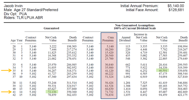
As you can see in the table above, if we assume the current 100% dividend rate of the company, it will take 8 years for me to break even (in other words, to have my current cash value accessible = amount of premiums I have paid in to the policy). If we exclude the non-guaranteed dividends, it takes even longer, at 14 years.
This is a significant phenomena to take in to consideration. Essentially, what it means is that in order to start earning the 4.5% long-term internal rate of return found in the studies shown above, we have to “wade through” 8-20 years of lower returns before we start averaging what the studies show.
In the policy illustration above, I manually calculated the guaranteed and non-guaranteed internal rates of return that you experience at various time points in owning the policy. Below is a summary of what I found (Please note that these are the cash value returns in a specific year only. The overall average return would be lower due to poor returns in the beginning years):
- In Year 2, you have a guaranteed return of -28.4% and a non-guaranteed return of -20.8%.
- In Year 5, you have a guaranteed return of -2.6% and a non-guaranteed return of 0.9%.
- In Year 10, you have a guaranteed return of 1.7% and a non-guaranteed return of 4.1%.
- In Year 20, you have a guaranteed return of 2.5% and a non-guaranteed return of 4.3%.
- In Year 30, you have a guaranteed return of 2.5% and a non-guaranteed return of 4.3%.
So, as you can see by these return calculations, the internal rate of return including dividends seems to be converging on the long-term reasonable assumption of 4.5% average return per year. Thus, I think that for once, the current whole life insurance illustrations are pretty conservative/accurate, and maybe even a little bit lower than what you might actually observe by living the policy long-term!
Mechanics of Infinite Banking – Policy Loans
While having your cash value accumulate at the respectable 4.5% after-tax internal rate of return mentioned above is good, the thing that makes the Infinite Banking Concept really work is being able to access the cash value tax-free, at any time, through policy loans. Thus, you want to make sure the whole life policy you’re looking in to does, in fact, offer policy loans!
Having made sure that the policy does in fact offer loan provisions, there are several other issues that need to be considered as well:
Policy Loan Issue # 1 – Direct vs. Non-Direct Recognition – Is There a Difference?
The first thing to look in to regarding policy loans is whether the life insurance company you’re dealing with does loans on a direct or non-direct recognition basis. Non-direct recognition companies continue to pay you a dividend even if you have taken out a loan on your policy, whether direct recognition companies do not pay a dividend on loaned money.
At first glance, it seems that if you’re doing Infinite Banking and taking policy loans, it’s a no-brainer that you’d want to use a non-direct recognition company (MassMutual, Lafayette Life are two examples of non-direct recognition outfits).
However, it actually turns out not to be so straight forward. As pointed out by this person who has both direct and non-direct whole life insurance, there is essentially zero difference mathematically between the two at the bottom line. It just differs in how they adjust the numbers. See explanation below for more details:
- With a direct recognition company, a policy loan does not decrease your death benefit, so the amount you receive in dividends as a percent of your ownership (death benefit) with the company, decreases.
- With a non-direct recognition company, a policy loan lowers your death benefit (ownership in the company), so the amount you’re paid in dividends as a percent of your ownership in the company stays the same.
Policy Loan Issue # 2 – Make Sure You Get a Policy With a Varying Loan Interest Rate
When I talked to a local Northwestern Mutual life insurance agent and had him run some policy illustrations for me, there were several things wrong with the structure that I later figured out on my own. First, the policy he had drawn up for me was designed to MEC out at Year 14, sooner than I would have liked, but never would have caught on to if I hadn’t of had another agent look at the policy design.
The second thing that was sub-optimal about the policy design was that it contained a fixed 8% loan provision, a fairly common thing for Northwestern Mutual policies. You can view where this fixed rate loan provision is stated in the policy illustration screenshot below:
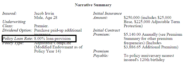
Of course, it’s easy to understand why having a fixed 8% loan rate (especially in today’s low interest economy) is not optimal. Sure, if interest rates increase to what they were in the 1980’s, you would be golden. However, since you’re only going to be earning 4.5% average return from your policy, you would be in quite the hole if you had to pay out a full 8% on the money you loaned out to execute the Infinite Banking Concept.
When I asked the agent about this potentially issue, he said that it was possible to have a variable loan rate with Northwestern Mutual, you just had to know to set it up that way.
So, in order to prevent this whole issue, make sure that the whole life insurance policy you are looking at contains a variable loan interest rate that goes up and down depending on what the current Fed Funds Rate is and correspondingly, what the insurance company is currently seeking in terms of required return.
Policy Loan Issue # 3 – A Policy Loan Is Not A Free Lunch
As mentioned above, taking out a policy loan using your cash surrender value is not without costs.
For example, if you have a whole life insurance policy with a non-direct recognition company, the money that you take out as a loan will still be earning a dividend/interest rate on it. However, you will also be charged a loan interest rate that you are responsible for paying (to the insurance company, not to your own policy) at some point in life or death. What this means is that you are essentially financially responsible for covering the spread, or the difference between the interest rate you’re charged and the interest rate you’re earning on the loaned money.
From my experience talking with several life insurance agents of non-direct recognition company, the spread seems to be fairly minimal (less than 1%). An agent from one company showed me a table that listed historical loan interest rate vs. cash value returns, and even though the spread seemed to fluctuate between positive or negative (so the difference between a loan making you money vs. costing you money), it seemed to generally be between 0.5-1%.
One eBook I read by an Infinite Banking practitioner mentioned that the spread that a policy holder generally must cover is between 0.5% – 0.67%.
Policy Loan Issue # 4 – Paying Yourself Back? Or Not?
One of the nice things about policy loans from whole life insurance is that you pretty much can define your own loan repayment terms. You either a) pay the loan back with interest as soon as possible or b) manage your loans in a way so that you never pay them back until you die. If you decide to do the later method, please note that when you die, your death benefit will be reduced by the outstanding loan balance + accrued interest.
However, it is definitely to your benefit to in fact pay back your policy loans + interest because it frees up more of your cash value to be used for future things/investments/expenses.
What Are Other People Recommending Regarding Infinite Banking? Is it A “Go” or “No-Go?”
By now, we’ve gone through the basics + the advanced mechanics of how the Infinite Banking Concept works.
As a next step, I now want to review the opinions of several people I talked to about whether or not this strategy is good to use:
- I talked to 1 Lafayette Life, 1 MassMutual, and 1 Northwestern Mutual life insurance agent, and they were all big fans of the idea, provided people could stick to the strategy and be comfortable with it. But, they all mentioned that it is not for everyone.
- I talked to one CPA who said that, “So far, every analysis I’ve encountered from sources I trust has shown it not to be worth pursuing. So, I haven’t done any additional research myself.”
- I talked to one personal finance blogger who does have a whole life insurance policy with Northwestern Insurance and is satisfied with it. He didn’t take out the policy specifically to do Infinite Banking though.
- I talked to one fee-only financial planner who said, “I’m not a fan at all of the Infinite Banking Concept. It’s glorified whole life insurance. I don’t like whole life in any of its shapes, forms, or variants unless you either a) have a special needs dependent and will need something close to permanent insurance to ensure a special needs trust is properly funded, or b) you’re going to have a net worth in excess of what gift tax exemptions currently allow for. The rest of the reasons cited by the whole life promoters are to line the pockets of the sales reps. If you can find someone who signs a legally binding fiduciary oath and sells whole life insurance, then you have found either a) the financial services equivalent of Sasquatch, or b) someone who is very, very ignorant about the risks he/she has just taken in signing that document.”
- I talked to another fee-only financial planner who said, “I’ve read a bit about it, but I have to say I’m skeptical. The whole concept I believe is based upon projections/illustrations that the policies will return. Most illustrations I see are rather ambitious which ruin the whole concept. I probably need to do more research to verify some of the specifics, but that’s my general take on it.
- I talked to two doctors who mentioned that they were using the Infinite Banking Concept because they wanted to further diversify their other investments, and since they had extra income that they wanted to invest after investing other places, it was a good fit. They also wanted a permanent death benefit for their children if they died.
Essentially, what I found from talking to these people can be summed up in one long sentence.
Unless I specifically need a permanent death benefit and/or am already maxing out essentially all of my other investment options (which I am not, but may be in the future when I’m making more money), the only people that are telling me that Infinite Banking is a good idea are the people who will directly receive money by me purchasing a policy.
This is a huge red flag for me personally.
Is the Infinite Banking Concept Right For You?
Clearly, the consensus from talking with others is that Infinite Banking is not something that would be worthwhile to look in to. However, in an effort to ultimately make a decision, I wanted to run my own analysis using 2 scenarios:
Scenario 1 – Saving money and having life insurance coverage using the Infinite Banking Concept with a whole life insurance policy.
Scenario 2 – Buying term life insurance for all my life insurance needs for the next 30 years and investing the difference between what the term life insurance costs vs. whole life premiums.
Analysis Assumptions – In order to simplify things to get started on an analysis, we need to lay out some things we’ll assume throughout.
- I do NOT need life insurance after I am around the age of 60.
- If you do need life insurance around this time, your best bet will be to have whole life since term life will be prohibitively expensive.
- I have $5,102 per year to either save or pay life insurance premiums.The time frame that will be analyzed is 30 years.
- I require $446,000 of life insurance coverage for the next 30 years to cover my family in the event that I die prematurely. This is the median death benefit shown on the policy illustrations drawn up for me between now and 30 years from now.
- The whole life insurance cash value accumulates at the rate of 4.5% per year discussed in the previous section.
- In Scenario 2, I will invest the difference in a vehicle with an approximately equivalent risk profile and tax treatment to whole life insurance (that is – very stable and tax advantaged).
- In this case, I will choose the Vanguard Short-Term Tax Exempt Bond Fund, which invests in federal tax-exempt municipal bonds with 1-2 year maturities.
- Since inception in 1977, it has averaged a before-tax return of 4.33% per year, which equates to a 4.05% after-tax return once a 6.5% state tax is subtracted out. In this time, it has been very stable, and according to the Simba back testing data, has not had a negative return during a 31 year period from 1985-2011.
- In Scenario 1, we will assume a level/constant cost of a 0.5% spread per year to access the whole life policy cash value through loans during retirement. We will also ignore the capitalization period for the first 7-11 years of the policy.
- In Scenario 2, we will obtain term life insurance quotes using State Farm’s life insurance quote system. For level-premium 30 year term coverage for $446,000, the annual preferred non-tobacco rate quote that popped up was $719 per year.
I assembled the table shown below to summarize the results of my analysis. You can also view the numerical results in spreadsheet form by clicking here.
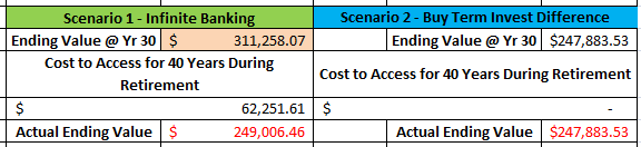
While this analysis is by no means perfect, I think it shows us in a good enough way how things would play out using Infinite Banking versus the alternative that I would choose in its place. Essentially, what we see is that because the whole life policy has a higher after-tax return, it actually results in a higher nominal ending value after the 30 year period analyzed.
However, since the cash value of a whole life policy is only accessible using policy loans (which carry a 0.5% spread cost that you must cover), it is quite costly to have access to that money during your retirement years. In effect, what we see is that you end up about the same with Scenario 1 and Scenario 2 after a very long run.
So, the question then becomes which would I choose? Clearly, why would I bother with all of the headaches of a whole life policy, potentially being done-over by a life insurance agent, the low/negative returns during the accumulation period, and all of the inflexibility that would go along with a whole life, when I can get about the same performance with something I firmly understand?
For me, it is clear that Infinite Banking is not right for me (and likely the vast majority of normal folks reading this) because…
- It doesn’t result in “stellar” performance that I cannot obtain on my own (as we saw above).
- It is difficult to understand, there are a lot of complexities that could easily mess the whole thing up, and gives me a headache trying to wrap my head around.
- I could not find anyone that is not being paid a life insurance commission that could convince me it was a good idea.
Who is a Good Fit for the Infinite Banking Concept?
Unlike others who have reviewed Infinite Banking and decided it wasn’t suited for themselves or indeed the vast majority of people, I do NOT think this strategy is the “devil walking the Earth.” In fact, there are some valuable things to learn from the strategy, and I think that the aim of it (having steady, reliable, tax-free access to cash) is well-intended.
More specifically, there are some really good instances where Infinite Banking would be nicely suited. I’ve listed a few of these below:
- People that do not have the discipline to “invest the difference”
- If you really have trouble saving money for retirement and are the type of person that needs some external encouragement, being required to send in a monthly/yearly premium to the life insurance company might not be the worst thing ever.
- People that really need a death benefit in retirement
- For most people, I think that having a death benefit in retirement is likely a nice thing to have, but probably not a requirement.
- However, if you are someone that really does need a death benefit during retirement since you have people that depend on you financially (and your savings cannot cover it), whole life insurance is really your best bet to obtain this.
- People that are pretty wealthy and are looking for another place to diversify, stash money, and avoid estate taxes.
- As I mentioned above, if I was to the point where I had so much money that I needed to find a place to put money tax-free, I wouldn’t be all that opposed to using whole life insurance.
- However, in this case, it really wouldn’t be Infinite Banking, but more just using whole life insurance…
How about you all? Have you ever heard of the Infinite Banking Concept?
What are your thoughts about it and whole life insurance in general as a savings vehicle?
Share your experiences by commenting below!
***Photo courtesy of https://www.flickr.com/photos/pictures-of-money/16678590844/sizes/l
Planning Ahead for Retirement Expenses

————————————————————————————————————————
Welcome to My Personal Finance Journey! If you are new here, please read the “About” or “First-Time Visitor” pages to find out more about us. If you would like to receive free updates on articles like this by email, then sign up here or you can subscribe to the RSS feed. Also, check us out on Twitter or Facebook. Thanks for visiting! Keep on learning!
————————————————————————————————————————
Click here to enter my free $50.53 giveaway for a chance to win 5% of My Personal Finance Journey blog income and give another 5% to a charity of your choosing! Deadline to enter is April 30th, 2013.
The following is a guest post. Enjoy!
There are some things that are never too early to think about, retirement being a good example. Retirement can be a difficult time if you don’t plan ahead. There is usually a lot to think about; in short, whatever age you’re at, there’s always something you can do to plan ahead or look into. Several things to think about specifically include understanding your budget, looking into retirement homes, and looking for any potential offers and benefits.
Pensions, Retirement Plans, and Budgets
Retirement homes
Offers and Benefits
How about you all? What steps are you taking at this point in your life to prepare for retirement?
Share your experiences by commenting below!
Jacob’s Thoughts – Listed below are my random thoughts as I was reading this article.
- Being fairly young (at the current age of 27 years old), I’m not yet to the point of thinking about the specifics of where I’ll live during retirement, etc.
- The main thing I’m focusing on right now is aggressively saving money in a three-legged stool mixture of tax-free, tax-deferred, and after-tax accounts to not only ensure I have enough money in retirement, but I will be able to draw on my savings in a tax-efficient manner.
***Photo courtesy of http://farm3.staticflickr.com/2551/4088699532_a154e1bfbf_o.jpg
Should You Incorporate Gold / Precious Metals in to Your Asset Allocation?

————————————————————————————————————————
Welcome to My Personal Finance Journey! If you are new here, please read the “About” or “First-Time Visitor” pages to find out more about us. If you would like to receive free updates on articles like this by email, then sign up here or you can subscribe to the RSS feed. Also, check us out on Twitter or Facebook. Thanks for visiting! Keep on learning!
————————————————————————————————————————
Click here to enter my free $50.53 giveaway for a chance to win 5% of My Personal Finance Journey blog income and give another 5% to a charity of your choosing! Deadline to enter is April 30th, 2013.
About a year ago, I spent a good bit of time analyzing the Permanent Portfolio concept created by Harry Browne in the 1980’s, both in a post on my own site and also a guest post for Flexo on Consumerism Commentary.
If you’re not familiar with the Permanent Portfolio that Harry Browne popularized in his book, Fail Safe Investing, it is a passively managed asset allocation strategy constructed by components in such a way that at least one component is favored by any of the possible broad economic movements. The Portfolio components are as follows: 25% in stocks, which do well in times of prosperity, 25% in gold, which does well in times of inflation, 25% in bonds, which increase in price during times of deflation, 25% in cash, which does well in times of tight money/recession when interest rates rise.
For the most part, I have covered 3 out of 4 of the Permanent Portfolio components pretty completely on my site. However, the one remaining (and fairly fascinating) component that I haven’t really dissected all that much is the gold / precious metals component.
As such, the purpose of today’s post will be to examine the in’s and out’s of how to decide if adding a gold / precious metals mutual fund to your asset allocation is appropriate.
Let’s get started!
What Does the Literature Say? – Adding Gold / Precious Metals to Your Portfolio
As is my tradition here when I analyze asset allocation, I always like to provide a summary of what the asset allocation experts think before launching in to my own investigation. As such, listed below is a summary of the opinions of several of my favorite asset allocation authors on whether or not the gold/precious metals asset class should be added to investors’ portfolios.
Indeed, one of the things that makes precious metals so fascinating is the amount of disagreement and controversy that exists between experts as to whether it is a worthwhile investment.
- Larry Swedroe (probably my favorite investing author I have found to date)
- In his newer 2010 book, The Only Guide You’ll Ever Need for the Right Financial Plan, Larry recommends that investors NOT hold gold/precious metals because
- 1) It has very high volatility,
- 2) May or may NOT deliver returns that compensate for the increased volatility, and
- 3) May or may NOT hedge against inflation effectively.
- Burton Malkiel
- In his famous and amazing book (2003 edition), A Random Walk Down Wall Street, Malkiel mentions that he used to be very negative about holding gold as an investment, but since 2002, has changed his mind slightly.
- He believes that gold/precious metals should not make up a huge portion of one’s asset allocation, but that a small amount (5% or less) can help diversify a portfolio.
- William Bernstein (my 2nd favorite investing author I have found to date)
- In his 2002 book, The Four Pillars of Investing, Bernstein recommends that even though precious metals have had extremely low long term returns and are extremely volatile, they should be included in small amount (2-3% or less) in one’s portfolio, provided that the investor is comfortable with them.
- This is due to the fact that they are 1) almost perfectly uncorrelated with other asset classes, 2) will be profitable during high inflation, and 3) the high volatility will allow for a rebalancing benefit.
- This perspective was approximately echoed in his 2001 book, The Intelligent Asset Allocator, as well.
- Rick Ferri
- In his 2006 book, All About Asset Allocation, Rick recommends that investors AVOID gold/precious metal funds because even though they have low correlations with other asset classes, they also have very low returns, causing it to not be worth the volatility.
So, as we might have expected, there is a lot of disagreement among the experts about whether it’s worth it for investors to hold precious metals. In fact, we have a 1/2 split among the authors above. Awesome!
However, there is ALWAYS agreement about 3 things – precious metals are..
- 1) Volatile and feature low correlation with other asset classes,
- 2) Not likely to produce good returns, and most importantly,
- 3) Should ONLY be invested in by investors that are comfortable sticking with them for long periods of time. And if this criteria is met, precious metals should only constitute 3% or less of an investor’s portfolio.
Gold and Precious Metals in a 1-Component Portfolio, 1972-2011
As usual, the first thing that I like to look at when analyzing an asset class for portfolio design is how it has performed by itself over a fairly long time period.
To do this, I again utilized the Boglehead.org forums Simba back testing data to analyze the performance of a $10,000 initial investment in gold and precious metals from 1972-2011 (data for precious metals is only available back to 1985, so I used gold as stand-in proxy for precious metals during the 1972-1984 time period).
The results of the back test can be seen on the graph below for the 1972-2011 time period, where the green line and purple lines represent gold and precious metals, respectively. I also modeled the same $10,000 initial investment in the Total US Stock Market Index (blue line) and Short-Term Treasuries (red line) during the same time period.
Looking at this graph, there are several interesting observations that can be made:
- Gold and especially precious metals have performed extremely strongly over the past 40 years!
- Just take a look at the (purple) precious metals plot. That asset class has outperformed the US stock market by a huge margin during the past 40 years.
- Of course, this is likely the whole reason why there has been so much “buzz” swirling in the investment community about gold and precious metals over the past few years.
- However, this is also fairly alarming/concerning to me because the long-term analyses from nearly every author mentioned above came to the conclusion that precious metals do not actually deliver high / good returns.
- This graph also very nicely shows how volatile precious metals can be!
- For example, in 2008, precious metals lost 56% of its value, whereas the total US stock market only decreased 37%. Now that’s what I call one volatile asset class, eh?!
Shown below are the detailed return numbers from 1972-2011 that go along with the 1-component graph/analysis above. As expected from what was reported in the literature, both the gold and precious metals asset classes displayed much higher standard deviations of annual returns than the overall stock market (in fact, between 1.5-2x more!).
Along with the high standard deviation, I also wanted to point out two other things that this data shows us. First, as was hinted to by the performance graph above, precious metals have delivered higher overall average returns than the US stock market between 1972-2011 (green highlighted cell above). However, the asset class was NOT very efficient at all at giving this high return, featuring the low ratio of return to risk of 0.42.
In plain English, this means that precious metals did not compensate investors as efficiently as the total stock market (or other higher risk/higher return emerging market / small cap value portfolio components often used to increase returns shown in the table below) for the amount of risk they shouldered.
Gold and Precious Metals in a 1-Component Portfolio, 1972-2002
To me, the results from the analysis above examining the 1972-2011 time period were quite surprising (and also made me a little skeptical).
During my research of the Permanent Portfolio, I encountered many warnings stating that investors should be skeptical of the superior recent performance of the Permanent Portfolio because long term bonds and gold/precious metals had performed at higher-than-historical levels of the past 10 years.
Taking this warning in to consideration, I decided to re-run my back testing analysis, starting with the year 1972, but chopping off the last 10 years or so from 2002-onward (please note that 2002 was the year in the graph above when the precious metals class really “took off” and started to outperform the overall stock market).
The table below displays the back testing return data results from the “shortened” 30 year period from 1972-2002. As can be clearly seen (red highlighted cells), the superior performance of gold and precious metals over the total US stock market sort of breaks down when the “Lost Decade for Investors” is excluded. In fact, precious metal average returns are about on par with the almost-risk-free Short-Term Treasuries, but feature 6x more risk. Regarding the return/risk ratio, precious metals are even less efficient in this 30 year period (only about half the efficiency of the total US stock market).
Correlations of Annual Returns – Gold / Precious Metals vs. Other Asset Classes
One of the few things that asset allocation experts definitely agree on regarding precious metals is that one benefit they do offer is a diversification benefit because of low correlation with other asset classes.
To provide some concrete numbers to this statement, I generated the correlation coefficient matrix below for the annual return data of gold, precious metals, short-term treasuries, and the total US stock market.
As you can see in the table above, the literature sure wasn’t lying when they said that there is a correlation benefit!
For example, precious metals only move in the same direction as….
- The total US stock market 24% of the time, and
- Short-Term Treasuries -19% of the time, meaning that they move in opposite directions!
Conclusions from 1-Component Portfolio Analysis of Precious Metals and Gold
Overall, the 1-component portfolio analysis above shows us that gold/precious metals..
- 1) Should technically provide us with a diversification benefit in our portfolio due to the favorable (low correlations), and
- 2) Should not be counted on to compensate us with sufficient returns to pay us for the large volatility they require us to shoulder.
Does Incorporating Precious Metals / Gold in to a Diversified Portfolio of Stocks and Bonds Improve Performance?
While examining the precious metals and gold asset classes in the isolation of 1-component portfolio is fairly interesting and provides some level of insight in what we can expect, it has not enabled us to draw a concrete conclusion as to whether adding this risky asset to our portfolio is worthwhile.
To try to find an answer, we need to look at how precious metals would perform if/when incorporated as part of a diversified portfolio.
To do this, I modeled a portfolio utilizing a set fixed income asset allocation of 30% (in short-term treasuries), and then filled the rest of the portfolio with a mix of precious metals (0-50% of the total portfolio value) and the total US stock market index asset classes.
The results of this analysis can be observed nicely on the graph below of average annual return (y-axis) vs. standard deviation/risk (x-axis). There are two plots – one for the 1972-2011 time period (blue line) and one for the 1972-2002 time period (red line).
Let’s start at the bottom of the plots, where the first point represents a portfolio containing 0% precious metals. As we add 0-20% allocations of precious metals, we see something “magic” happen – portfolio risk decreases, but portfolio return increases! Nice, right?! So, adding precious metals over the past 40 years definitely would have increased portfolio performance!
If you dig through the detailed numbers, you see that the maximum efficiency (highest ratio of return to risk) occurs around an 18% portfolio allocation to precious metals.
Surprisingly enough, the ~18% allocation level to precious metals was found to be the most efficient level for both time periods, despite the lower performance of precious metals when the analysis was stopped at 2002. It is also fairly interesting to note that this level almost aligns with the Permanent Portfolio allocation to precious metals, which was 25%! Crazy uh?
Reality Check – Is it “Worth It” to Add Precious Metals / Gold to Your Portfolio in a Small Amount?
In the section above, we see that there is clearly a significant benefit to adding a large amount of precious metals to your portfolio over the past 40 years.
However, there is a problem with this – one that I mentioned was stopping me from adopting the Permanent Portfolio fully. The problem is that holding the optimal ~20% allocation to precious metals would cause most, if not all, investors to have tracking error in their portfolio (in other words, lose discipline to their set strategy and change their allocation).
Because of this, I am going to say that unfortunately, the level that was found to be mathematically optimal in the modeling above does not work in the real world.
Having established this belief, the questions then become, 1) “If it is clear that adding precious metals to a portfolio improves performance, how much is a realistic amount to add? 2) And, with this realistic amount, is the increase in performance worth the trouble of holding this sometimes “pesky” asset class?”
Let’s explore the first question – how much of an allocation to precious metals is realistic. For me, given the varying opinions about precious metals among experts in the literature and the fact that it isn’t a very efficient and/or reliable asset class, I would say that 3% is a good maximum allocation I would be able to give to precious metals.
Having established this realistic allocation level, we can then explore how much, if any, benefit the small addition would give us in a diversified portfolio.
To do, this we need to dig in to the precise return numbers utilized in building the risk/return curves in the previous section, specifically focusing on the less than 5% precious metals allocation. The two tables below show the resulting data from this analysis, one table for the 1972-2011 period and the other for the 1972-2002 period.
If we look at the 1972-2011 period, we see that the “mathematically” optimal precious metals allocation of 20% gives us an extra 1.2% annual return on average. However, if we utilize the more “realistic” precious metals allocation of 3%, we only receive an extra 0.18% return each year. If we equate this increase in annual return to ending portfolio value, we would have 9.4% more money at the end of the 40 year period by holding 3% of our portfolio in precious metals.
If we examine the 30 year period ending in 2002, the case for holding a small amount of precious metals becomes somewhat less compelling. When we move from having no precious metals to a paltry 3% allocation in precious metals, we only receive 0.11% more in per year average return. If we again equate this increase in annual return to ending portfolio value, we would have 5.3% more money at the end of the 40 year period by holding 3% of our portfolio in precious metals.
So, by having a realistically small amount of 3% of our portfolio allocation in precious metals, we can increase our portfolio’s ending value by 5-10% over a 40 year period.
The question I ask myself is, “Is this relatively small increase in ending value that we receive by adding a precious metals to our portfolio worth the risk of the tracking error that might be introduced to my portfolio by the addition?”
Conclusion – For me (and for likely the majority of investors), I am going to say that precious metals / gold are not worth adding to your portfolio because it is more likely that holding precious metals will cause you to change your strategy before realizing the tiny benefit that holding precious metals might give you.
Furthermore, if I wanted to increase returns, I could likely just increase my allocation to an asset with a more trusting risk/return profile, such as emerging markets and/or small cap value stocks.
If you’re interested in viewing all of my calculations from this investigation, click here to view the Google Docs Spreadsheet.
Conclusions and My Personal Path Forward
So, after going through all of this investigation looking at precious metals and gold, what’s the overall verdict? Well, I think it can be summed up in a couple of key-points:
- From a purely mathematical perspective, investors should incorporate precious metals / gold in to their asset allocations up to 25% of their portfolio in order to achieve higher long term returns with lower risk.
- However, since investors are human and we all have emotions, allocating a large amount of your funds to precious metals simply does not work.
- Mathematically, a small realistic allocation of only 3% to precious metals should increase returns and decrease risk slightly. However, the improvement is only marginal, and again, investors likely will not be able to stick with even this small allocation for 40 years.
- Because of these considerations, I personally wish that myself and other investors could incorporate precious metals, but unfortunately, I don’t think it is very beneficial.
How about you all? Do you have gold and/or precious metals incorporated in to your asset allocation? If so, what allocation level do you commit to this asset class?
Has the recent superior performance of precious metals and precious metal equities influenced you to re-evaluate your position on this asset class?
Share your experiences by commenting below!
What Component Mix Should Make Up Your International Equity Allocation?

————————————————————————————————————————
Welcome to My Personal Finance Journey! If you are new here, please read the “About” or “First-Time Visitor” pages to find out more about us. If you would like to receive free updates on articles like this by email, then sign up here or you can subscribe to the RSS feed. Also, check us out on Twitter or Facebook. Thanks for visiting! Keep on learning!
————————————————————————————————————————
Click here to enter my free $50.53 giveaway for a chance to win 5% of My Personal Finance Journey blog income and give another 5% to a charity of your choosing! Deadline to enter is April 30th, 2013.
Several days ago, I shared an investigation on 1) the reasons/benefits of incorporating the international equity asset class in to your asset allocation and 2) the approximate optimal level in which to make the addition.
Essentially, the analysis of the ~40 year period between 1972-2011 revealed that holding 30% of your equity position in international stocks provides the highest return/risk ratio. This aligned very nicely with the advice from the literature saying that the optimal level is between 30-40% of your total equity allocation.
Having decided upon our optimal overall international equity allocation target, the question (that I want to investigate in today’s post) then becomes, “What type(s) of specific international funds or international sub-asset classes should make up this international equity allocation?”
Let’s take a look at answering this question, shall we?
What are Your Options for Components to Build Your International Equity Allocation?
The first step in trying to seek out an appropriate answer to this question is to figure out what international equity options are available to us in the first place.
For me, I personally like to keep the bulk of my investments in Vanguard index mutual funds. If we visit Vanguard’s mutual fund website and narrow the selection to International Index Funds, the following equity choices are displayed:
- Developed Markets Index, Ticker Symbol VDMIX
- Emerging Markets Stock Index, Ticker Symbol VEIEX
- European Stock Index, Ticker Symbol VEURX
- FTSE All-World ex-US Index, Ticker Symbol VFWIX
- FTSE All-World ex-US Small-Cap Index , Ticker Symbol VFSVX
- Pacific Stock Index, Ticker Symbol VPACX
- Total International Stock Index, Ticker Symbol VGTSX
- Total World Stock Index, Ticker Symbol VTWSX
At first glance, the list above looks a little bit overwhelming. So many choices to pick from, right?!
Dissecting through this list of options a little more, I decided to rule out the total world stock index fund because it invests in US companies, which we are trying to get away from by investing internationally.
The next confusing aspect we have on this list is that we have a total international stock index fund and an FTSE all-world ex-US index fund. A common question that people ask is, “What makes these two international funds different?” It’s very reasonable to ask this question because at first glance, they appear to be the same type of non-US equity index fund. In general, one can assume that the total international index fund is the better choice because 1) it has a lower expense ratio and 2) is more broadly diversified because it includes not only large and mid (like the FTSE fund), but also small-cap international stocks as well.
Having removed these two funds for the reasons mentioned above from our list, let’s proceed…
WHAT DO THE BOOKS SAY? – INTERNATIONAL EQUITY Components / Breakdown
- Larry Swedroe (probably my favorite investing author I have found to date)
- In his newer 2010 book, The Only Guide You’ll Ever Need for the Right Financial Plan, Larry mentions that emerging market equities, while being more volatile, also provide a higher expected return and a low correlation of returns with both domestic and international developed equities. Because of the low correlation, an investor should only hold enough so that he or she does not introduce tracking error to their portfolio. He then proceeds to recommend that an investor hold no more than 10% of their equity position in emerging market equities because doing so could increase the overall portfolio volatility above tolerable levels. Lastly, he mentions that the correlation of emerging markets to other equities increase during times of turmoil.
- In Larry’s books, What Wall-Street Doesn’t Want You to Know and The Only Guide to a Winning Investment Strategy You’ll Ever Need, Swedroe provides an example portfolio with the following recommendations for international stocks as a % of your total equity position – 10% large value, 5% small, 10% small value, 5% emerging markets.
- Burton Malkiel
- In his famous and amazing book, A Random Walk Down Wall Street, Malkiel recommends an international equity allocation consisting of a 2:1 ratio of developed international markets to emerging markets.
- William Bernstein (my 2nd favorite investing author I have found to date)
- In his 2002 book, The Four Pillars of Investing, Bernstein recommends an international equity allocation consisting of a 1:1:1:1 split among European, Pacific, emerging markets, and international value stocks. This perspective was approximately echoed in his 2001 book, The Intelligent Asset Allocator, as well.
- Rick Ferri
- In his book, All About Asset Allocation, Rick provides what is in my opinion, the most complete explanation of how to slice and dice among international equity components.
- He recommends a 1:1:1:1:1 split between Pacific, European, international value, international small cap, and emerging market equities.
Conclusions from the literature – From the books written by the four authors above (some of the best on asset allocation I have found to date), it’s obvious that there is not consistent agreement as to the optimal international equity allocation split.
However, for me, one clear conclusion is that I need to be careful with how much emerging markets equity I load in to my portfolio (keeping in mind the 10% of equity limit mentioned by Larry Swedroe perhaps), since this is clearly an asset class that can be quite volatile. In addition, there seems to be a a trend that the experts like to invest in region-specific index funds instead of just owning a fund that represents everything. This could be an important thing to investigate.
Which International Equity Components Recommended in the Literature Are Possible?
Since I like to invest with Vanguard (and they unfortunately do not have all of the mutual funds in the world), I am limited to the index funds that they offer. In this case, Vanguard does not currently offer an international large-cap value or small-cap value index fund. Therefore, we can scratch those international asset categories off of our list for consideration.
So, that leaves us with the remaining Vanguard funds shown below. In order to move forward, the next thing we need to figure out is what each of these funds invests in/represents. To this end, I’ve listed the allocation of each fund below as well.
- Developed Markets Index, Ticker Symbol VDMIX (Intl Dev)
- 64% Europe, 36% Pacific.
- Developed foreign markets in Europe and the Pacific only.
- Emerging Markets Stock Index, Ticker Symbol VEIEX (EM)
- Emerging markets only around the entire world (100%).
- European Stock Index, Ticker Symbol VEURX (Europe)
- 100% Europe developed markets (no emerging markets).
- FTSE All-World ex-US Small-Cap Index , Ticker Symbol VFSVX (Intl Small) (has the highest expense ratio (0.45%) of any Vanguard index fund I could find, so this is a pricey one to hold!).
- Small-cap companies only around the world, both emerging and developed markets.
- 22% emerging markets, 39% Europe, 25% Pacific, 14% North America, 0.3% Middle East.
- Pacific Stock Index, Ticker Symbol VPACX (Pacific)
- 99% Pacific developed markets (mostly consisting of Japan and Australia), 0.7% Pacific emerging markets.
- Total International Stock Index, Ticker Symbol VGTSX (Total Intl)
- Represents the market weightings of the entire ex-US world, both developed and emerging markets, in the percentages shown below.
- 19% emerging markets, 44% Europe, 29% Pacific, 0.4% Middle East, 7.7% North America.
Having listed out this information, I then was curious to see what type of performance these 6 asset classes have had over the past 40 years or so. To do this, I again used the 1972-2011 data from Simba’s backtesting spreadsheet from the Bogleheads.org forums.
The average annual return, standard deviation of annual returns, and return/standard deviation ratios are shown in the table below for each asset class. In the table below, I have also listed the data for the Total US Stock Market Index (MKT-TSM) for comparison as well.
There are several interesting findings from this table above.
- We see that the emerging market and international small-cap asset classes provided a MUCH MUCH MUCH higher average return than the other asset classes, as we might expect, given the significant increase in risk associated with these asset classes.
- The return/standard deviation ratio for the emerging markets and international small-cap asset classes is on par with that delivered by the total US stock market, so those asset classes provide some nice opportunity for increasing returns, provided that one can stomach the increased risk.
- The Pacific equity asset class provided the least-efficient ratio of return/risk.
Question # 1 – Is it Worthwhile to Hold Individual Region-Specific Developed Market Index Funds?
After looking at the return data above for 1972-2011 and also reviewing what is in the literature, I still was left questioning whether or not it is actually beneficially to hold region-specific developed market funds (so for Europe and the Pacific area). Or, would I be about as well off if I simplified it all and purchased just one fund that represents everything?
In his book mentioned in the literature section above, Rick Ferri provides a wonderful argument for why it is in fact better for investors to hold index funds of individual developed market regions (Europe and Pacific) vs one that represents the entire class. The reason for this he describes is that the weight of the various regions can vary GREATLY depending on the market conditions around the world. For example, over the past 40 years, the majority stake of the developed market index has swung 3 times between the Pacific and European regions. He suggests that instead of depending on a total market fund, which is subject to these fluctuations, it is more efficient for an individual to hold a consistent equal weighting of developed market equity in Pacific and European regional index funds.
To test out Rick’s hypothesis, I back tested the performance of two portfolios over the past ~40 years, one consisting of 100% the International Developed Market Index Fund, and another carrying a constant 50/50 split between the Pacific and Europe regions (the regions that make up the Developed Market Index Fund). The results are shown in the graph below.
As you can clearly see, the 50/50 split portfolio (blue line) between Pacific and European regions outperformed the 100% international developed portfolio by a good margin over the time period analyzed.
The table below shows the exact average annual return and standard deviation (risk) data from this analysis. As you can see in the table, the 50/50 portfolio provides a more efficient (higher) ratio of return/standard deviation, indicating the there is in fact a benefit to investing in region-specific index funds.
Conclusion/Answer to Question # 1 – Yes, it does seem to be worthwhile to invest in region-specific index funds (in a 50/50 ratio in Pacific and European index funds) to gain developed market equity representation.
Even though this split does not give us exposure to Canada, we’ll ignore this deficiency for the time being and continue on with the investigation…
Side note: I’m not sure why, but there’s just something that I don’t personally favor with the idea of investing in a region-specific index fund versus a total international market fund. It seems like investing in just two regions would somehow exclude some areas of the world…However, more on this preference later!
Question # 2 – Should Emerging Markets and/or International Small-Cap Index Funds Be Incorporated?
From the investigation above, we now know how to assemble the developed market mix of our international equity portfolio using the Pacific and European regional index funds.
However, what do we do with the more volatile and higher-returning international small-cap and emerging market asset classes? Do we add them to our portfolio? And if so, how does it work incorporating them in with general developed market equities?
In order to seek out some sort of answers for these questions, I back tested an international equity portfolio consisting of 25% Europe, 25% Pacific, and then varying amounts of Emerging Markets and International Small-Cap equities to complete the portfolio (time period was again 1972-2011). The average return and standard deviation results can be seen in the table below:
What we can observe in this table is a little bit surprising. When we add increasing amounts of the international small cap asset class, the volatility does decrease, but it does so slower than the accompanying decrease in return. What this means is that adding international small cap equity does NOT make our portfolio significantly more efficient.
Because of this finding and the fact that the International Small-Cap Equity Index Fund carries such a high expense ratio, I do not think it is worthwhile to add to my portfolio at this time.
However, this data does clearly dictate the the inclusion of emerging markets is quite important!
Conclusion/Answer to Question # 2 – Including emerging market equity seems to be very significant in increasing returns and efficiency of an international equity portfolio. The addition of international small-cap equity seems much less important / potentially not worth the cost of owning that asset class.
Having answered this, let’s explore the action of including emerging markets a little further.
Question # 3 – Does the Incorporation/Balance of Emerging Markets Control International Equity Portfolio Construction?
Because of the dominating effect that the inclusion of emerging market equities had over international small-cap equities in the investigation in the previous section, I then hypothesized the following:
Hypothesis/Question: If I incorporate a significant level of emerging market stocks in to my international equity allocation, will the dominating effect make it less important to worry about buying region-specific funds (something against my personal preference)?
Essentially, what I’m thinking is that if I just incorporate emerging market equity in to my international stock portfolio, I could just simplify everything and complete my international portfolio with a total international stock index fund. This type of fund would also provide coverage of Canada as well, which is also a plus!
To see if I could validate my hypothesis, I back tested the 3 international equity portfolios described in the bullets below during the common time period of 1972-2011. For my emerging markets allocation, I used the optimal 50% emerging market level found in the Question # 2 section above and filled the remainder of the portfolio with developed, region-specific, or total international market funds. The performance results can be seen on the graph below:
- Green Line – Portfolio consisting of 25% Pacific, 25% Europe, and 50% emerging markets.
- Blue Line – Portfolio consisting of 50% international developed equity and 50% emerging markets.
- Red Line – Portfolio consisting of 50% total international market equity index and 50% emerging markets.
The graph above reveals something fairly intriguing. In fact, what we see is that the green and red lines are essentially overlapped, indicating that there isn’t much difference between holding half of your international equities allocation in a total international fund vs. investing in separate Pacific and European region-specific funds. However, you do get a significantly less efficient portfolio if you were to use a developed market index fund over a total international fund.
To add some definite numbers to the performance seen in the graph above, I assembled the return data in the table below:
Looking at this data provides us with some form of an answer to Question # 3 –
- The amount of emerging market equity essentially drives the performance/returns of an international equity portfolio.
- There is not much difference between using a total international index fund vs. Pacific and European region-specific to gain representation for the developed international markets.
Putting it All Together – Defining What Split You Should Maintain Between International Developed and Emerging Markets
To recap, so far, we have essentially seen that the most important decision to make when investing in international equities is to define a mix you’re comfortable with between emerging and developed markets. How exactly you decide to represent the developed markets carries less of an overall effect.
So, what is the optimal % that emerging market stocks should represent in your international equity portfolio?
It’s an intriguing question. Let’s take a look!
In order to put in to context everything that has been covered in this post and the post from several days ago that investigated the optimal overall international equity allocation to carry, I modeled various portfolios consisting of 30% short-term treasuries and 70% equity from 1972-2011. The equity portion of the portfolios consisted of a constant split of 70% total US stock market and 30% international equities. Finally, inside the international equity sub-allocation, I modeled the average annual returns and volatility (standard deviation) that would have resulted using increasing amount of emerging market stocks, ranging from 0-100% of the international equity sub-allocation. The total international market index was used to fill the remainder of the international equity portfolio.
The results of this investigation can be seen in the return/risk graph below (each point represents an additional emerging market allocation of 10%). Let’s start on the left side of this graph, where we have no emerging market stocks. As we might expect from the risk/return trade off, we obtain increasing amounts of return as we add increasing amount of emerging market stocks.
To go along with this, it’s also beneficial to examine the real numbers that were used to construct the above graph. This data can be seen in the table below.
In my opinion, the two most important and useful columns of this table are the last two – the one showing the average return / standard deviation ratio and the one showing the slope of the return/risk curve.
What we see when we examine the return / risk ratio column is that the portfolio that is numerically the most the efficient is the one whose international equity allocation consists entirely (100%) of emerging market stocks. However, in portfolio construction, the most efficient allocation is useful unless an investor can actually stick with it for a very long time.
Because of this, the short/easy answer to the question of how much emerging market exposure to carry is basically, buy as much as you can sleep well at night holding.
However, a more practical answer to this question can also be obtained by examining the last column of the table, showing the slope of the return / risk curve. Essentially, what this column is showing us is how much increase in return we get per unit increase in risk. Because of how the slope is calculated, a HIGHER slope number is better for us as investors.
Keeping this in mind, we see on the table that the slope of the return curve is highest between the range of 0-20% emerging markets (as a % of international equity holdings). What this means is that we definitely want to have around 20% emerging markets in our international equity portfolio to take advantage of this benefit.
When we add more emerging market stocks (between 30-50%), the slope is pretty much constant, albeit less than it was between 0-20%. When you add emerging markets to above the 50% level, there is another significant decrease in the curve’s slope.
So, my overall takeaway from this analysis is that we want to take advantage of the slope of the risk return curve by holding a minimum of 20% and a maximum of 50% of our international equity position in emerging market stocks. Aside from the mathematics of this, I think that going above 50% emerging markets might cause tracking error for most investors.
If you’re interested in checking out all of the detailed calculations/numbers I used for the back testing in this post, click here to visit the Google Docs Spreadsheet.
CONCLUSIONS, MY CURRENT INTERNATIONAL Equity Mix, AND PATH FORWARD
So, after going through all of this investigation comparing varying mixtures of international equity asset classes, what’s the overall verdict? Well, I think it can be summed up in a couple of key-points:
- Figuring out which specific components to use to build your international equity portfolio can produce quite a headache because of the varying opinions among experts in the literature, confusing terminology in figuring out what assets international mutual funds hold, and common lack of low-cost options to normal investors.
- It is more efficient to gain exposure to international developed markets by investing in region-specific Pacific and European index funds vs. simply holding a developed market index fund that represents everything.
- However, the incorporation of the emerging market asset class is much more significant as far as driving portfolio behavior than the decision of whether or not to use region-specific developed market funds.
- By examining the behavior of incorporating emerging market equities in a complete 70/30 equity-fixed income portfolio, we see that investors should take on as much emerging market exposure as they can (within their international equity allocation of course!) without incurring tracking error.
- However, the most significant contributions to increasing portfolio return while only marginally increasing risk occur by having 20-50% of your international equity allocation in emerging stocks.
- First, I could technically improve the efficiency of my portfolio by adding a small amount of International Small Cap stocks (~5% of my international portfolio).
- However, that would only add up to be 1% of my total portfolio, which is in my mind, too small of an amount to bother with and to pay the 0.45% expense ratio for.
- Therefore, I don’t think I will add any small-cal international stocks to my portfolio at this time.
- Second, I could technically increase the efficiency and return of my portfolio by increasing my exposure to emerging market stocks above 50% of my international equity portfolio.
- However, I feel that adding more might expose me to some tracking error, and the total international stock index fund I owe also already has exposure to 20% emerging markets as well.
- So, I’m going to stick with my current emerging markets allocation at this time.
- Third, I could technically make my portfolio marginally more efficient by investing in Europe and Pacific region funds.
- However, this just seems like it would be more complex than needed for the marginally improvement, since I already have incorporated emerging market equities in to my portfolio which mostly drive the international equity return.
- In addition, I like that the Total International Index Fund gives me a little broader market exposure by including Canada.
How about you all? What type of component mix do you have in your international equity portfolio allocation?
Are there any potential changes you are thinking of making any time soon?
Share your experiences by commenting below!
5 Steps To Owning Your First Home

————————————————————————————————————————
Welcome to My Personal Finance Journey! If you are new here, please read the “About” or “First-Time Visitor” pages to find out more about us. If you would like to receive free updates on articles like this by email, then sign up here or you can subscribe to the RSS feed. Also, check us out on Twitter or Facebook. Thanks for visiting! Keep on learning!
————————————————————————————————————————
Click here to enter my free $50.53 giveaway for a chance to win 5% of My Personal Finance Journey blog income and give another 5% to a charity of your choosing! Deadline to enter is April 30th, 2013.
The following is a guest post. Enjoy!
Can you afford it?
Research, research, research
The all important home loan
Buying the home
Moving in
How about you all? If you have purchased a home before, what is one thing that you figured out after the fact that you wish you had done at the beginning of the home buying process?
Share your experiences by commenting below!
Jacob’s Thoughts – Listed below are my random thoughts as I was reading this article.
- Looking back on my experience purchasing a condo, I think the most important step in the process was figuring out the finances, as that is really what drives the whole process.
- It’s important to be pre-approved for a home loan (not pre-qualified) that is sufficiently low enough to allow you to meet your long term savings goals while paying back your home loan.
***Photo courtesy of http://www.flickr.com/photos/stevendepolo/3608960341/sizes/o/in/photostream/